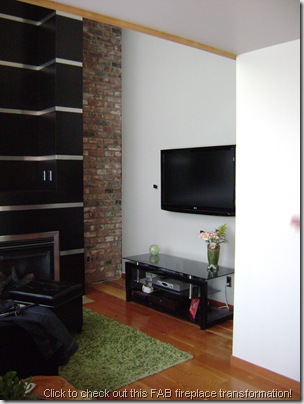
I’ve had so much fun sharing the transformation of my client Kate’s condo with you! First there was the makeover of Kate’s kitchen – from light maple to gorgeous, sleek black – followed by the complete remodel of a not-so-special fireplace into an urban contemporary masterpiece (it’s too FAB to be humble about!!). Apart from showing you a small craft project I did for a wall next to Kate’s kitchen, I haven’t updated you on our progress for some time.


We also painted the powder room found behind the door to the left – I used Benjamin Moore’s Spanish Olive (previously Beach Glass); a nice soft yet fresh green, the accent colour we’re using on the main floor. Sorry… no pic!
I DO have a photo of my painter, Bradford… my brother! He’s a fantastic artist and musician – not just a painter of walls – and I plan on writing a post about him as soon as he gets his website up. Come on Brad… get moving!! I love this photo of him with a paint brush in his headband and “war paint” on his cheek – it honours his creativity, personality and our Aboriginal heritage!
But I digress… :-)
Right now, though, we’re in the process of ordering wallpaper for Kate’s bedroom!! I love wallpaper and I’m so excited that Kate has agreed to let me hang some in her space.
Here are a couple of photos showing her bedroom and the walls I’ll paper:
Can you see that the ceiling is a different colour from the walls? That’s Abalone grey you’re looking at. These walls are still builder beige – I’ll prime them in the paper’s background colour before it’s hung on the wall. The room is obviously a work in progress so don’t judge it just yet!! By the way… the stairs to the lower level are behind the headboard. The room looks down into the living room with a glass railing around two sides of the space.
The colour scheme for this space?
Purple, Grey/Silver and Orange!
Kate found this fabulous pillow for her bed that will be perfect for the room and she’ll hang a large picture of her beautiful pup Sanja on the wall (here’s a photo of Sanja and my doggie Simon [on the right]). So… Purple & Orange. :-)
Now comes the part where you get to help us pick the wallpaper! We have a few favourites – and I’ll tell you which ones they are – but we’d appreciate your comments and thoughts on our shortlisted options! The papers we’re looking at are designed and made by Anderson Prints and are distributed here in Canada by Crown Wallpaper & Fabrics
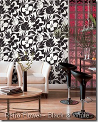
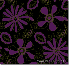
From The Jazz Collection
I’m not keen on the shade of purple in this paper… but I LOVE IT in black and white. If Kate decided on the B&W version of this paper we’d up the purple accents in the space. It could totally work with her new pillow and would look wonderful with the large picture of Sanja that she wants to hang.
This paper has the purple that Kate wants with a grey that works with the Silver Fox colour found on her large wall, visible across the stairs from her headboard. They didn’t have a photo of the paper on a wall, that’s why you’re looking at the paper in blue. Not a bad pattern, but it’s not our favourite. And I can’t see it with Kate’s new pillow or her picture of Sanja.
From The Moda Collection
LOVE IT! I think that this might be Kate’s favourite, too, although I’m not 100% sure. It’s absolutely perfect with her pillow and, with the right frame, could work with the photo of Sanja. Yes, it’s dark… but if you take a look at the room again you’ll see that it’s extremely bright… she can get away with dark paper!
LOVE this one too! Unfortunately Anderson Prints website didn’t have a photo of the grey & purple in a room-view so you have to judge the pattern size and overall look of the paper in dark grey & orange. I really like the size of the leaves… very dramatic. The light grey background would also be perfect with the wall/ceiling colours. Finally, I think Kate’s new pillow and her photo of Sanja could work with this paper. Problem… I know that Kate isn’t as crazy about this paper as I am. If you like it, let us know!! Maybe your love will encourage her!!
Finally, Sunflower Ogee. There’s no doubt that the paper is beautiful… but I have to say that I’m not over the moon about this one. I like the tone-on-tone black prints, but I’m not loving the large purple flowers. The colours would work with Kate’s pillow… not sure about the picture of Sanja. I’m also not sure of Kate’s opinion of this paper… I hope she doesn’t like it more then the three I’m loving from above!!
**********
Okay… now it’s time for you to share you thoughts on our paper options! There’s no doubt that Kate has shortlisted some bold prints but she’s looking to create an urban contemporary feel to her space and I feel strongly that these designs will lend to that affect. She’ll be ordering the paper this Tuesday so time is of the essence; get your comments in!! :-)
I’ll update you as we make more progress!
Victoria from Edin Interiors


![[05.12] Simon & Sanja [05.12] Simon & Sanja](https://blogger.googleusercontent.com/img/b/R29vZ2xl/AVvXsEjyVzeFrAUIIt97tQP5jkT1Yw3zfpTzPoWUds-rKf1zVy3nO60EGXeuySzFx9d0wPowFjab-M4HZzSQ2WKox6I1mkfcNnj6jgKT53_BOAgET9Cwl-KjjwIvyHRsoYOTDau3YYz-he-jy0s/?imgmax=800)


6 comments:
My favorites are the retro flower in black and white or the grey with the purple leaves. And the more I look at them and read what you want to do with the room, the more I'm leaning toward the grey/purple leaves. Now you have my two cents! Kathy
I thikn my favrotie is the first one- the black & white flowers!! but there are lots of pretties!!!
xoxo
:)
My first instinct was the black and white (because that's what I liked best), but I really think for the look Kate is going for the grey with purple leaves is the best. My least favorite is the one with big purple flowers. As a Victorian house owner, I'm not shy about dark paper, but that one turns me off. I think the grey would be a nice background for anything in the colors you mentioned. :D Jewel
Lovely blogs design.
Leaf, grey 'n purple! I do like the black 'n white however I feel if one was feeling under-the-weather they may not find it so appealing.
(On occasion I have problems with Vertigo and when I saved and enlarged the pattern with my Editing Program, I said "oh dear, not for me".)
I like the one with the orange leaves! No surprise there :)
Post a Comment
Note: Only a member of this blog may post a comment.