If you’re a regular reader of DesignTies you’ll know that I’ve been having a lot of fun remodelling and decorating my first client’s condo. So far 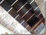
Now that all the hard physical work is done, Kate and I have been working on decorating her great space.
Recently Kate came home with a little inexpensive print (about $11); black faux suede stretched on a frame and printed with flowers in grey and white. She liked the print (she especially liked the price!) but didn’t know how she wanted to use it.
I took one look at the print… and had an idea!
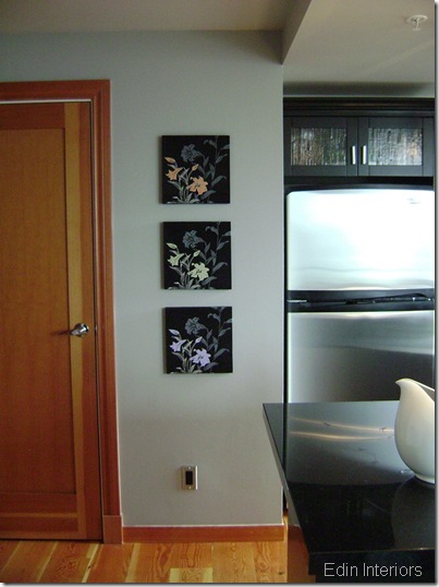
I asked Kate to buy two more identical prints so that she had 3 in total… and I told her where to hang them. Here’s a photo of the prints hung on the perfect wall next to her kitchen.
Urban contemporary with a feminine twist is the look we’re trying to achieve in Kate’s condo so we’re working with black and grey as the dominant neutrals in the space, with orange (dictated by the fir floors & doors… and Kate’s dog Sanja… HaHa!!) and a fresh apple green as the accent colours on the main floor. The upper loft – black, grey & purple as the accent, and of course a touch of that orange again.
With these 3 accent colours in mind (orange, green, purple)… I decided to paint the white-outlined flowers to coordinate! So off I go to the art supply store where I purchased some fabric paint.
How disappointing! I painted each of those darn colours on the suede prints and the colours didn’t show at all! What a waste of time. I needed a solution. So… rather then head back to the art store I pulled out some old cans of wall paint and started mixing!
With a little of my dining room colour, mixed with some white, I came up with a perfect orange for one print.
But what about the green & purple flowers?
I had several cans of green paint in the basement but they all had grey undertones so the resulting mixed colour was very “dirty”. And I didn’t have anything in purple.
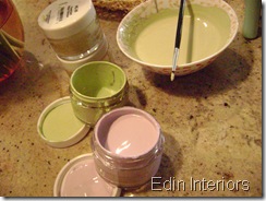
So… off I go to Benjamin Moore for sample pots!! Perfect solution!
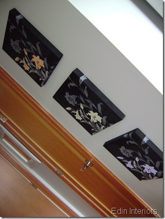
And I set to painting the final two prints…
Kate loves the final results… and hopefully you will too!
I had a lot of fun with this little project! What a great way to take a simple and inexpensive set of prints and make them unique and special – just for Kate’s space!!
Hope you enjoyed this crafty transformation!








27 comments:
This is absolutely perfect! What a great idea? I would have NEVER thought of this, and there are so many times that I pass things by that this would be a great solution for ... thank you SOOOOOO much for this fantastic inspiration!
What a great idea! I would never think to buy two or three of the same prints but now I'll think otherwise! Very clever!
Happy Met Monday!
Dear Victoria! Darling you are a genious!! These prints look so perfect!
Be a sweetie,
Shelia ;)
I fully agree with you Victoria, and I love how you personalized these fabric prints and made them unique. (The same rule can apply to when doing a 'kit'. ie: Cross stitch, needle point, paint by numbers, etc.) My motto is: 'add, subract, multiply or divide...make it your own'.
If you don't mind can I include a little tip to those who might wish to try some fabric painting. When using ACRYLIC paint (craft or household) add some 'fabric medium' to it. (It is usually clear and can be found in the craft paint section). It prevents bleeding and provides paint-flow, working time plus adherence.
Great inspiration and post.
This is ~Kate~ proud owner of Kate's condo that is being transformed into the lovely livable space that I've dreamed of. Victoria's ideas-turned-reality radiate the place. She is awesome!
Thanks Kate! I'm blushing!! :-)
Thank you also to Artie, Linda, Sheila and Mrs. Ben for such positive comments!
Victoria
Victoria, how inspiring. I would never have thought of this. However, I wouldn't think of half the wonderful things you dream up. I love how different they look and the colors are just perfect. Hugs, Marty
What a great idea! When I saw the first shot of the 3 on the wall, I thought it looked great. But when you got through with them, wow! I never would have thought to do this, and it's perfect. Kate is a lucky gal! Can you come to Texas lol. Kathy
You made something that was ok and made it great! I'm impressed.
What a great idea! Who knew you could paint fabric? I'll put that little tip in my pocket!
oh what a fantastic idea Victoria, the art looks fantastic!!!
hugs
janet
What a fun idea! I love this.
Looks great! I love the contrasts.
- Marie
And people ask why I love paint so much!! These turned out so well. Isn't it fun that you can turn something ordinary into something custom with a brush and a little paint. I've always said that it's not technique that makes an artist...it's knowing what to create in the first place!
Oh gosh Victoria, you always have such great ideas! Love these!
Great job thinking outside the box on this one! I love the idea of taking one print x three and adding the color!
Those look soooo good. Thanks so much for the kind comment.
Very creative Victoria and they turned out beautifully. Super idea. Going to file this one away for later use ;)
Jane
Victoria, you are so creative! And a really good painter too =D
Hi Victoria! You are absolutely the smartest one! This looks great and I'm sure your client loves it too!
You did a marvelous job!
Thanks for popping in to see me.
Be a sweetie,
Shelia ;)
What you did with the three prints is ingenious! I love it.
I also think your transformation of that fireplace and kitchen was spectacular!
*thanks for stopping by and leaving a comment about my bed crown.
Rhonda
Oh I adore this project! Well done. The use of color to transform the images was brilliant.
How brave. I would have been afraid to paint them but they came out great. Now they pop off the wall. Thanks for the nice comment on my closet shelves. I really appreciate it.
This is such a smart idea!! They turned out fabulous, Victoria I think you are really an artist at heart. Love it!!
Nancy
What a GREAT idea! I love how they turned. Way to go!
marcie
You are so talented with the projects! I don't know how you come up with all these ideas. This is such a great way of adding a personal touch to your space.
Purple, Yellow....great feel to watch out excellent pics, design, color...perfect matching of tiles & walls color...beautiful pics.
Post a Comment
Note: Only a member of this blog may post a comment.