
Being a down-to-earth, jeans-and-T-shirt kinda rocker guy, I envisioned something… well, to be honest, I’m not really sure!! Turns out, his home is nothing like I expected it to be. But then, what DID I expect it to be?!
Bryan’s home was designed by French interior designer Tristan Auer. Bryan and Tristan met in 2003 when Bryan was looking for a designer to decorate his vacation home in the West Indies (ahhh, the life of a rock star!!). Bryan showed Tristan pictures he had ripped out of magazines that reflected his style. Turns out, they were rooms that Tristan had designed.
Bryan was looking for a home in Paris with a glass roof that would let in lots of light. He found an 18th century carriage house on Ile Saint-Louis that fit the bill—although the red carpeting on the floors and WALLS had to go!! The overall design is minimal and white, infused with hits of colour here and there. Take a look and see what you think…
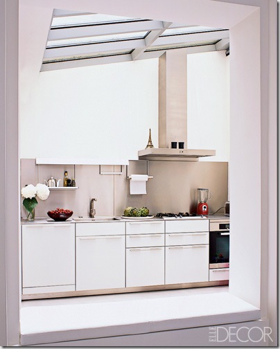
You can get a glimpse of the glass roof in this picture of Bryan’s kitchen (check out the little Eiffel Tower on the range hood).
And a better view of the glass roof in his photography studio.
The living room with a big gray sofa. Looks comfy!!
I’m guessing the room through the doorway is the main bedroom. Looks like the corner of a bed and a little turquoise night table…
Not sure what room this chaise is in or what it’s used for. Looks a bit lonely to me!!
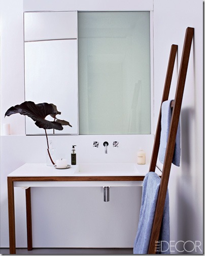
Like the rest of the apartment, the bathroom is white and simple.
The wood cabinets, table, and chairs add some colour and warmth to the dining room.
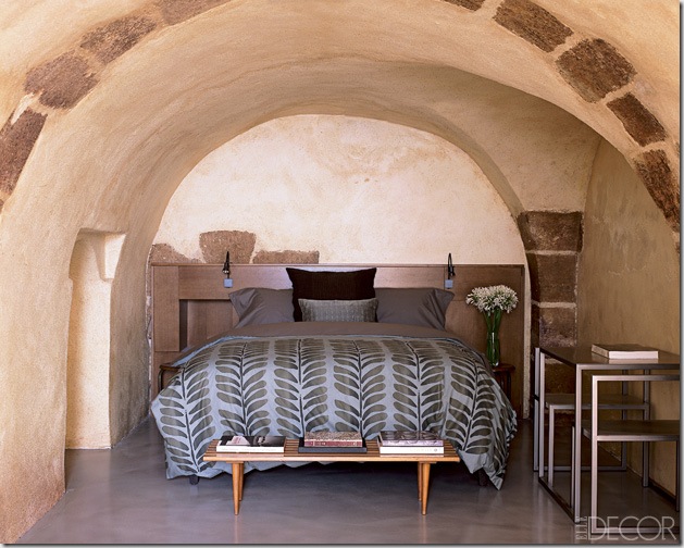
And finally, the guest bedroom has a completely different look and feel. It’s in the basement of the carriage house, and retains the original stone walls and ceiling. The bed looks rather comfy, tucked into the arched niche…
So what do you think—does this look like the home of a rock star?? Do you like the minimal design?? Are you a fan of white with touches of colour, or do you like colourful houses better?? Feel free to share your thoughts on Bryan’s Paris home :-)


9 comments:
"Everything I do, I do it for youuuuuu...." I'm a huge fan of Bryan Adams too. I actually love what Tristan Auer did to Bryan's vacation home. I love the simplicity,the glass roof and all the open space. My favorite decorated room is the guest bedroom but it looks so small (and the low ceiling does not help). And I also like the lonely room with the chaise :). It looks like a good escape room. I can see myself in there with a good book and absolutely NO phone.
Beautifully designed and studied spaces.
Would not change a thing except the guest bedroom. It looks nice as a setting but maybe not too comfortable to be in it.
I think it's nice, but not my style. I like color! And pretty things surrounding me. I get this magazine at home and I just pour over it - I love it!
Almost too simplistic, however if Brian likes it that is what counts! He must have some little French Maid (smiles) to do the housekeeping.....light flooring throughout.
LOVE the guest bedroom architecture... Everything else feels a bit minimal/ cold to me but I understand sometimes wanting that for a getaway-- total simplicity & not lots of stuff. But I have to say it doesn't really float my boat. love post like these!!!
xoxo,
lauren
Magazines seem to love these kind of spaces. Houses without clutter photograph so well and are easy to style. I do love different pieces that work together to create a look that doesn't seem to polished!
I need to google him and check out that eyeliner phase...somehow I must have missed that! Honestly, I'm not digging his house! It doesn't feel homey to me...except for that guest bedroom!! Now if the whole house was in that style...it would be a different story! :) Although, I do like the little Tower on the hood! Cute touch! He must not have put it there...or maybe being the eyeliner guy he is, maybe he did!
~angela @ peonypatch
I like it!
being so very private it surprises me that he shared it with a magazine...
Simple and great as he is.
Post a Comment
Note: Only a member of this blog may post a comment.