Third week of my Design Basics course and I’m having a blast… and learning things, too of course! Ha!!
Yep… I’m even enjoying the homework! Am I crazy?!
For our first assignment students were charged with defining design (not specifically “interior design”) in 3 to 5 sentences. After conducting some research of my own I reached out to our blogsphere readers for their input. Thanks to those of you who responded! My definition? I’m shy to share!! Okay… remember that I’m a budding designer with lots to learn!!
Design is an idea, concept or solution resulting from creatively and technically applied research, knowledge & experience. This process consciously explores methods to communicate and express these ideas/concepts/solutions in a visual, functional and aesthetically attractive way. Design itself is dynamic and always in flux; it reflects the knowledge and experiences of the Designer and are easily affected by learning and life opportunities.
What the heck?! My advice? Don’t ponder what design is, just do it!
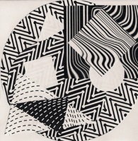
Our second assignment was a lot of fun. Our instructor, Andrea, had us create 6 paper “tile” renderings, 6”x6” in size. On those tiles we were asked to work with 9 shapes – 3 small, medium and large squares, triangles and circles… 9 shapes all together. BUT… we had to use parallel lines to describe each shape.
Confusing?!
Hopefully three of my tiles will help you out:
Playing with these shapes and prints, working to create different images on each tile – images with form and flow that made sense to me - was what made this project fun. I got to play with the weight,shape and intensity of lines in a way that conveys thought, process and creativity.
But what’s the point of this exercise? I found out during class on Thursday evening.
Next week’s assignment… we have to chose 2 of our favourite tiles from the 6 we created and – from each tile – identify 2 three dimensional (3-D) ideas/practical applications. WHAT? Well… I have to explore each image and found a design or concept within that image.
Let me show you what I see when I shift around one of the above tiles:
Can you see it, too? The wavy lines from the background suggest the desert sands, the triangle and the square are the great pyramids (remember that they’re square when viewed from above) and the circles are the hot desert sun. Cool hey?! And NO… I didn’t create the tile with the pyramids in mind… I saw them once Andrea asked us to look.
Perhaps not a practical application (!!) but definitely a concept! :-)
When considering the same tile my son suggested that the image made him think of a TV remote control or a Playstation controller. Okay… typical man-boy! In his defence, his concept would be a practical application of the tile’s design.
But there’s more to the assignment… I actually have to flesh out and fully develop 1 of the 4 ideas inspired by my 2 favourite tiles.
Let me show you the tile and the concept I’m going to present to the class… see if you can see what I see!
- a beautiful herringbone parquet floor
- a circular area rug
- a modern chaise lounge (larger triangles) with side table (square)
- a square table flanked by two mismatched chairs
Now I have to take my idea to a three dimensional concept!! I wish I had Michelle’s (A Schematic Life) beautiful rendering talent or Paul’s (Kitchen and Residential Design) Google Sketchup skills!
I am good at Googling, however… a REAL talent!! :-) Here are a few pics I’ve found to inspire me:
A fabulous and modern chaise lounge from MDF Italia in my favourite colour! Doesn’t it make you think triangle?
In love with the herringbone parquet floors at the Louve!
And what about a crazy black and white rug like this?
Or… maybe it’s too literal! :-)
I still need to find a table and the 2 mismatched chairs… but I will!
And then I’ll have to draw it 3-D. Yikes!!
Now it’s your turn…
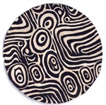
What do you see in these 3 images?
BTW… Kelly sees eggs and toast in the centre image. HaHaHa!
Victoria from Edin Interiors


3 comments:
Thanks for the mention Victoria. And in response to your question, in the first one I see New York's Flatiron building when seen from above, complete with the buildings surrounding it and the pedestrian crosswalks on the street. In the second one, I see a panorama of newly plowed fields on a spring morning. Either that or a jumble of herringbone tweed overcoats. And for the third I see a computer's hard drive, but that's easy. How about a an art deco wall sconce in an old movie palace?
Great assignment though. I used to love those black and white design exercises. Have fun and don't censor yourself!
Victoria here are my takes on image number three. 1) Landscaping and accessory elements to create an outdoor space. 2) Architectural shapes for one of Kelly's Solariums/Sunrooms. 3) Small appliance design elements for an indoor electric griddle.... which by the way cooked Kelly's eggs.
Thank you for sharing this most interesting exercise regardless that I most probably failed.
Good luck on your course! -Brenda-
Victoria, where are you taking these classes I would love to take something like that. It is so much fun. Yes eggs and toast on a round dish. We must be hungry. I also see fish in the sea.
Post a Comment
Note: Only a member of this blog may post a comment.