
I finally got around to reading the magazine last week. When I got to the article about the home featured on the cover, I slowly clued in to the fact that I know this house!! I’ve never been in it, but whenever I go biking and do the loop to Parliament Hill and back, I pass by this house, which is just across the canal from Lansdowne Park. And every time I pass by, I wonder what this house looks like on the inside, because it’s not anything like its neighbours on the outside…
Once upon a time, there was a red brick Victorian house on Echo Drive. It was built in 1924 and looked like this:
And then a couple of years ago, the unassuming red brick Victorian underwent an extreme makeover and turned into this!!
As you can see in the before and after pics, the facade of the house up to the roofline didn’t actually change that drastically. The new front door and windows are essentially in the same places as the originals, right down to the little oval window beside the door.
But that’s where the similarities between the old and the new end. The entire interior was gutted and the top floor was chopped off and rebuilt, complete with the cantilevered extension above the front door. How much is that doggie in the window?? ;-)
The couple that bought the house in 2007 hired architect Paul Kariouk, with the intent of doing some simple renovations. As the three of them discussed what needed to be changed, they came to the realization that the homeowners’ preferences and lifestyle needs, as well as a leaky roof and poor insulation, weren’t going to be addressed with the planned renos. So what was originally a simple project morphed into an extensive project that completely changed the feel and function of the house. They even took the dog’s needs into consideration!!
You can read more about the thought process behind the design on Paul Kariouk’s web site.
This is the BEFORE:
And this is the AFTER:
Paul Kariouk describes the home as a vertical loft. There are very few interior walls and no real rooms in the traditional sense. The whole interior is like a single multi-level room in which various spaces have been created, suspended, or delineated.
OK, let’s go inside!! Here’s the layout of the first level to get our bearings. (The front of the house is on the left in all the floor plans).
The front entry has a grate in the floor with a drain underneath it. The homeowners use the hand-held shower to clean off their muddy boots and their muddy dog :-)
The parlour is to the left of the entry. Love the floor-to-ceiling (and beyond!!) windows.
Standing in the parlour and looking towards the back of the house. The room at the bottom of the stairs is a wine cellar. The white cubes above the main level are the second level “pods”. You’ll see what I mean in a minute…
And looking towards the front of the house.
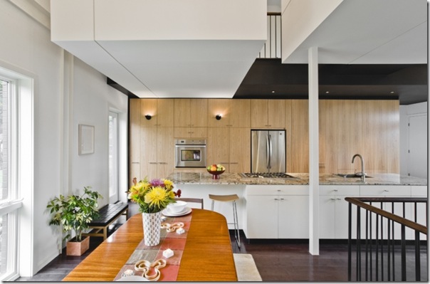
The kitchen consists of a wall of cabinetry and an island the size of a small country!!
Let’s move up to the second level. The design up here is really unique — rather than formal rooms, the second level library, den, and study are “pods”. The den and study have half-walls, making them completely open to the rest of the house. The pods are accessed from an open catwalk corridor.
I’m guessing these books can be accessed from inside the library…
The den pod is in the middle, and the study pod is at the back of the house (bottom of the picture).
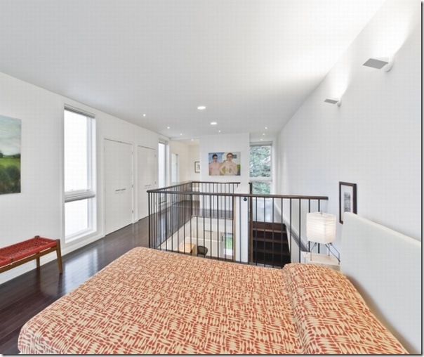
And finally, up to the third level, home to the master bedroom and the cantilevered extension.
Kariouk had to work hard to convince the homeowners to go with his vision of the cantilevered extension. How did he manage to get them onboard?? He told them “if you don’t do this cantilevered thing (love that technical term!!), this house’s exterior will be completely unmemorable.” How true — without the cantilevered “thing'”, I’m not so sure I would have even noticed this house on my bike rides. This is how Echo House looks from the bike path. (Image from Google Maps)
Here’s a shot of the cantilevered extension during construction. That view would have been enough to convince me to do it!!
And Kariouk’s proposal showing the cantilevered extension. He even included the dog :-)
Although you’d think floor-to-ceiling windows in a bedroom would be très risqué, the way the house is sited keeps the top floor and the master bedroom out of the neighbours’ sightlines. Even so, I think I’d feel way too exposed walking around naked in here, especially at night!! But wow, the light in the room and the views are spectacular!!
The stairs from the master bedroom join the catwalk corridor on the second level. The grass outside the window is on the rooftop terrace.

And a peek into the ensuite shower.
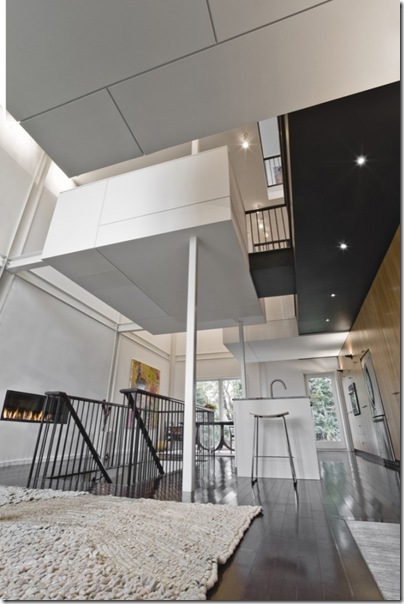
A few more cool interior shots. This one is looking up at the den pod.
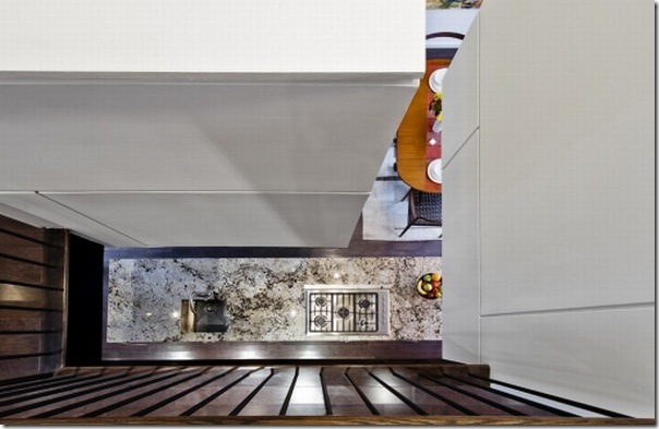
The view looking straight down into the kitchen from the catwalk corridor between the den pod on the left and the study pod on the right.
Looking from the den pod down into the living room.
Thanks to Ottawa Magazine for taking us inside this bright, beautiful, and truly unique Ottawa home. Hope you enjoyed the tour of Echo House as much as I did!!
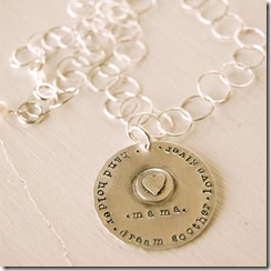
Don’t forget to enter our Lisa Leonard giveaway to win this beautiful necklace:
Sources:











18 comments:
Wow, I don't really know what to say. I am not a fan of the ultra modern/contemporary style that this house has, but I will say that it is pretty darn cool. I can't imagine the amount of time and money it took to plan and execute all of these details, but I'm sure the homeowners (and the dog) love it. Thanks for sharing this with us!
Wow, that house in unbelievable! I especially like that the front entry has a grate in the floor with a drain underneath it. There has been numerous times where I have needed that! What an undertaking though...I don't know if I could do it!
wow that's hell-of-a change! Really like the architecture, but I wish they would have gone a bit softer on the interiors. I think super modern furnishing in a super modern house can feel a bit cold.
It's funny bc I love old houses, but I also enjoy super modern houses. Nothing in-between though. They are all Ick! LOL
That is incredible! Also, I love the dog's schedule!
I love the dark flooring throughout! And I love the open concept except for the bedroom..., I need a door to close!
Wow! Ihave never been a fan of contemporary architecture but can appreciate good design and this is pretty amazing!! I finished the porch re-do finally!! Come by and take a peek when you have a chance, have a wonderful Thursday,Kathysue
I am not a fan of contemporary homes but I can certainly appreciate the beauty in this one. Those pods are ultra cool and this house despite being modern is very livable and warm.
Amazing house inside out.
And I want those bookshelves.
Kelly - the transformation of this house is breathtaking and from the archtectural point of view a spectacular piece of work if not true vision. What I also like very much is the humorous aspect of the dog - very funny - and showing that there was much heart involved in this. BUT despite the magnificent work of the architect I would never want to live in such a house - I would never have a feeling of cozyness, warmth, of protection and feeling at home.
I would like to have the views of this house - which are truely spectacular but there are too many white walls, too many edges. This house gives me sort of creepy feeling because I would suspect something menacing behind all those "valleys" and edges....
Oh what an incredible home! It reminds me a lot of the conversion artist Charlie Pachter did to his Toronto home...This one is stunning, I could live there....
Wow...one of the most innovative and cool floorplans I've seen in a while! Love the looki-loo points from the top floor.
Best,
Michelle
Love that transformation! WOW....my doggies sit in the bay windows, also staring at the squirrels with disgust!!!...Grrrrrrr
That is a pretty crazy transformation! This home is quite incredible, I wonder what the neighbours thought during construction, ha ha! I absolutely love the warm dark tone of the wood flooring throughout the house, stunning!! Thanks for sharing it Kelly :)
Nancy
Wow! That is amazing! I can imagine how much thought and work that was put into this transformation! A Victorian type house to a modern house - wow!
What an amazing transformation! I really want that library and shower room, yum!!
Amazing results, and what tremendous vision! I wonder if the neighbors were OK with the new look of the house {they're probably jealous}.
It's amazing what architects and designers can do to completely remake an interior.
It is not a place where I pesonally would like to dwell :), but have to say it is so perfectly orchestrated and sophistically unique that IT IS BEAUTIFUL in its own way. Thanks for sharing.
-Brenda-
Post a Comment
Note: Only a member of this blog may post a comment.