It was a lot of work — we had to produce 35 drawings (our choice) plus 6 assignments in 7 weeks. I thought I’d share some of my drawings with you to show you that if I can draw, then anyone can draw!!!
I have this problem where I can envision in my mind how I want my drawing to look, but somewhere between my mind and my hand, that vision gets totally messed up. My biggest problem is scale — I just can’t seem to draw things to the right scale. They come out too stretched out or too scrunched up.
After frustrating myself with drawing #9, hubby taught me what I thought was a silly trick, but turns out to be the proper way to get the scale right. You hold your pencil straight out in front of you and use it measure the height and width of the item you’re drawing. Sort of like when you see an artist holding up their thumb and squinting their eye. I used the pencil technique to draw one of our leather armchairs, and it actually turned out right!!
Using this technique helped a lot. Not to say that every drawing came out how I wanted, but there are a few that I’m happy with. I was originally going to draw just a section of our car, but I got on a bit of a roll and ended up drawing the whole thing. Other than the tires, it came out pretty good :-) I hope you can tell what kind of car it is!!
One afternoon, I sat out on the front porch with the intention of drawing the trunks of our birch tree. But that didn’t quite go according to plan, and I ended up drawing the porch instead. I must have been really into what I was doing, because I didn’t even notice how hard the concrete step that I was sitting on was till two hours later!!
The next drawing is one of our assignments. We had to choose a picture of a room provided by our teacher, and then we took home half of the picture and had to draw a mirror image of it. This was actually one of the easier assignments for me. Not sure why, because I’m so not into symmetry!!
By the way, this room belongs to designer Anne Hepfer. I selected it because I absolutely love everything about this room, especially the mirrored coffee table and screen :-)
You can see more of Anne’s beautiful home at Canadian House & Home and in the book, Spectacular Homes of Toronto.
I like how this patio chair came out. The table, not so much, so you can just ignore it :-)
Do you remember my sexy copper toaster??
Not quite as sexy in pencil, but not too bad :-)
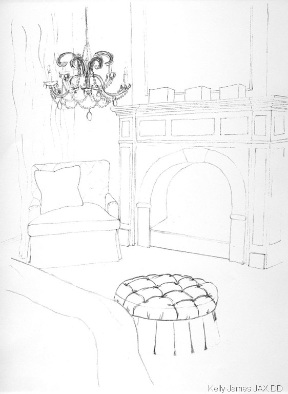
And finally, for our last two assignments, we all had to draw the same room with a chair, fireplace, curtains, and bed.
Then it was up to us to elaborate with accessories, details, texture, and shadowing…
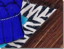
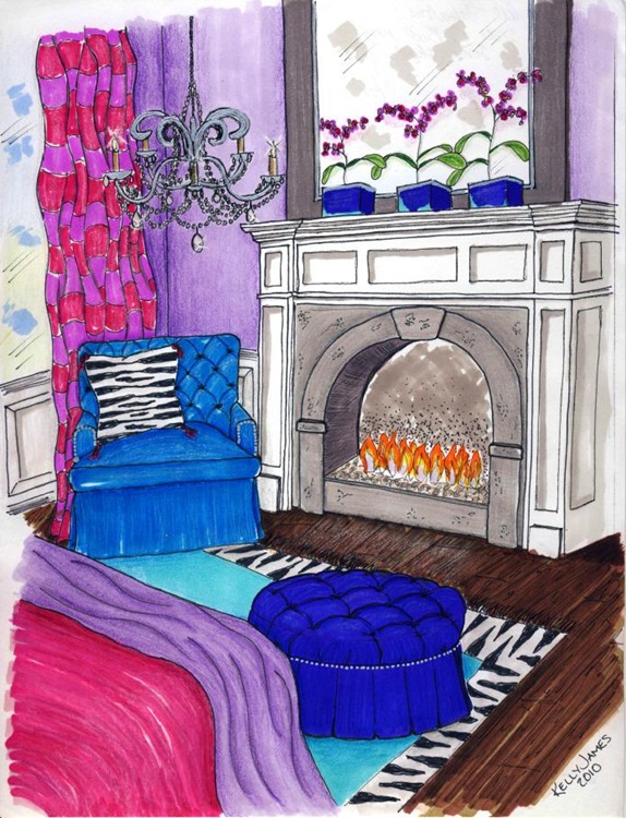
For the final assignment, we had to create a colour version of our room. I made some changes from the pencil version, because I wanted to glam it up a bit :-)
And finally, after more hours of thinking and drawing and colouring than I care to remember, the final version was done!!
Not exactly the Mona Lisa, but at least it’s a step up from deformed stick people :-)


26 comments:
Wow Kelly! Your drawings are amazing! And that last one is unbelievable. You should give yourself more credit - you are not a lousy drawer! And you have officially made me want to get into an decor program!
Ah, I remember my drawing class and thinking I can't draw either. You won't believe what you can render when you get to the end of all this.
I think your drawing are great....love the final assignment.
These are fabulous... I mean it!!
These look great Kelly - love the shading and tufting in the last image. I remember spending hours and hours drawing and rendering perspectives at design school. My favourite part was adding colour, pattern and texture at the end - drawing accurate perspectives, not so much.
These are fantastic!!! I cannot draw whatsoever..., you've got the gift!
Well done Kelly! I don't know what you are talking about not being able to draw--crazy lady. Makes me wish I had taken that course. My drawings do NOT look like that. 8)
Kelly, I am truly impressed, you must have had some hidden talent. Brava.
Are you kidding me? You're great at drawing! Your hubby is right on, the straight arm holding a pencil is a legit technique used for scaling, and by the looks of it it worked wonders!
--> I'm so NOT surprised that you picked purple for the walls in your last drawing though ;) I know it's your favorite!
You're doing great Kelly, good job!
Kelly,
You can learn and do anything with the right teacher. You conquered an I can't and turned it into I can! Let this great image stay with you mentally when you approach the next hump. You can do anything...great job Kelly!
Bette
Kelly
these are wonderful.
Kelly, you are good!
Woohooo Kelly - this is awesome !!! You're being so modest !! "A Schematic Life" might have some competition coming its way ;)
enough with the i can't draw bit. these are great. i wish i was taking that course with you!!!
Yay, Kelly! These are fantastic drawings! Renderings have always been my biggest challenge, too. It really does take patience if it doesn't come naturally. I'll have to try the pencil trick...didn't learn that one in my drawing classes. Way to go, girl!
Hope you're enjoying your summer. It's been a busy one for me. I have to really catch-up on my DesignTies posts. Take Care!
Kelly
Wow they look great and you told me you couldn't draw. I told you that you would be surprised what you could do after that class. It ended up being fun didn't it after all that work....
your drawings look great - well done!
I wandered over here from What's Up Whimsy and I must say, you seem like a terrific artist to me! I'm jealous you took that class... Thanks for the progression pictures and I'm sure I'll be back :)
Not being able to draw almost stopped me from going to interior design school but I was so determined I enrolled in classes at Emily Carr and BCIT (I loved in Vancouver at the time.) I remember being so nervous at those classes. I didn't want to show anyone my wonky drawings.
The wonderful thing is that it can be learned, especially design drawing. Perspectives are actually incredibly easy once you've been taught all the tricks. The sad thing is that hand drawn renderings and drawings are used less and less each day. Now, it's all about the computer, which is a whole different set of skills!
Your drawings are gorgeous Kelly!! I love them, I think you should frame some of them :) That must have been pretty tough to do so many drawings in such little time, but I bet this increased your confidence didn't it?? You did such a wonderful job, that last project turned out amazing :)
Nancy
That's amazing Kelly...great work!! I'm so an awe:) I love your brave use of colour!!
Best,
Michelle
I love it! I think you are a budding Mona Lisa.
As well as a budding Da Vinci! LOL!
Great job! good for you. that pencil technique is the best,that's the way I was tought to draw in design school
Your drawings are beautiful. I know that the computer drawings can be rotated, lighting can be adjusted for date and time, etc., but hand renderings make the presentation so personal, much like the difference between getting a letter typed on a computer vs one hand written in ink with lovely penmanship on beautiful paper. It's fun to see drawings where the person has developed his own style of drawing and coloring, which I think you have. I think that by giving this to a client, it would show that you cared enough to do this just for them and could make the designer/client relationship stronger. My husband has done these for years and it really adds a special touch to the presentation.
Great job! I personally love rendering by hand. I took a great class when I was in design school and I just noticed they have another that teaches you to render in watercolours!
Post a Comment
Note: Only a member of this blog may post a comment.