It wasn’t long after Kelly and I started writing & sharing with DesignTies (January 2009) that I discovered Maria Killam’s blog Colour Me Happy. Ever since then, her colourful world 
I’m crazy about Maria!
Before I took her course however, I had Maria come over to our home to help us chose a wall colour for our kitchen and living room. Working with a colour consultant – especially one as talented and professional as Maria – was a fantastic experience!
Well… it’s taken forever… but Brian and I finally painted our living room in the colour Maria suggested! What colour? Benjamin Moore’s “Powell Buff, HC-35”.
We love it!
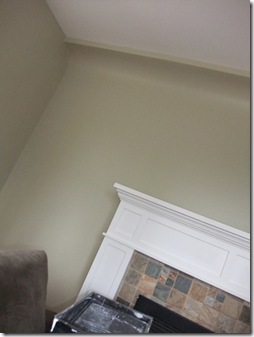
Take a look at the before…
I had originally chosen to paint our living room in Benjamin Moore’s “Richmond Grey, HC-96”. I thought that with the word “grey” in the name it would mean there’d be more… well… GREY in this shade of green. Instead, what I got was almost a soft lime green!

But light wasn’t Maria’s primary concern when she saw the room. For her it was the colour of the fixed element of the room: the slate stone tile in our fireplace. And “Richmond Grey” did NOT work with the tile, no matter what direction the light was coming from! Take a look at what Maria says when choosing colour that works with a stone fireplace.
Then… take a look at how great Powell Buff looks with our slate tile!
We feel that the new wall colour is SUCH an improvement! The Powell Buff will be a wonderful backdrop to the art I’m planning for over the fireplace… and throughout the room. It will also be a lovely neutral to support many fabric options for reupholstering the chair you see above, and for a new sofa we hope to purchase very soon!
Thanks Maria… for your perfect colour advice AND for my fantastic “Colour Expert” training!!
Looking to fill your life with perfect colour? Get in touch to make arrangements for a consultation.


14 comments:
Love her blog--how fun that you got to learn about color directly from her! The paint she chose for that room really is perfect with the slate. Can't wait to see what else you have in mind for the room!
What a surprise to scroll along on Facebook this morning and see this lovely post on me! Thanks Victoria, I will have to figure out how to include it in a post on my blog--it's wonderful!!
Thanks again,
Maria
Love the whole area! Fab fireplace and tilework and the color is the perfect compliment. It's easy to see how you are an expert in all things, design!
The colour looks fantastic, it complements the slate. Great job!
Tracy
It's true, the color is quite perfect with your stone around the fireplace, I love it! It looks warm and inviting as well. Thanks for the tips about the color of light coming from the east, west, etc. I had no idea!! I always learn something from your posts :)
Nancy
Love the new wall colour. So great that you took Maria's course - I'm sure you learnd alot.
Not only is Maria a genius with color, she is also a very generous blog mentor. She really cares about helping us newbies navigate the journey of blogging. I've been an artist all my life, studied and applied color for me and my clients, but I learned something today from your post. It just shows 'when the student is ready the teacher will come!'
Love the tip about the colour of light coming from each direction. Very helpful! The new colour looks great. Amazing what a subtle colour difference can do.
What a great teacher! I really love the colour! And the fireplace is gorgeous. I'm looking forward to seeing the art you choose to put above it!
The colour is fantastic! I love reading Maria's blog - so much to know about colour! Wish I had the $$ to take a course of hers!
I'm a big fan of Maria too. The colour is spot on with your fireplace, which is a really lovely element of the room. Looking forward to seeing it with the new furniture you're planning.
So pleased I stumbled across your blog. That colour looks amazing on your wall. Can't wait to see the chair reupholstered. Look forward to your next post - I'm your newest follower! Michelle
When I discovered Colour me happy blog, totally new world of colours opened to me. I've always done it by intuition, but Maria's blog helped me a lot to understand a colours in a better way. I wish I could have the opportunity to take her course,too.
Can't wait to see update of your living room, I'm sure it will look great :)
What a transformation! The first thought to hit me when I saw the before pics was that the color didn't match the stone at all, lol! I love the new color, it's so perfect and ties it all together!
Post a Comment
Note: Only a member of this blog may post a comment.