The June 2009 issue of Metropolitan Home features the home of Miami designer, Doug Meyer. When he bought the house (built in 1941), Doug says that it was in a “strange state”. Some people might think it’s in a strange state now!! Crazy, quirky, or cool — take a look and see what you think….
Doug painted a bright yellow and white flower motif on the front porch…
The living room sofa is a vintage Florence Knoll piece and is upholstered in a bright Kelly Green cotton from Brunschwig & Fils. The fireplace wall is covered with a curtain of beaded silvery chain. Doug says of the wall, “I always love spaces at night, and this glistens. And when the air conditioning is on, the beads move slightly. It’s almost kinetic.”
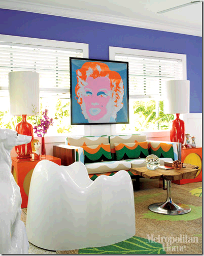
In the Florida room, the upper walls are painted Benjamin Moore’s California Lilac. A 1962 Marilyn silk screen by Andy Warhol hangs above the sofa. It’s kind of neat the way it overlaps the windows — sort of adds another dimension to the room. The fabric on the sofa is from IKEA. And if you think the white chair looks like a humongous tooth, you’re right!! It’s a Wendell Caste Molar chair. Wait till you see the bright pink ones on the patio!!
Doug painted this cabinet with orange lacquer and created the piece of artwork on the wall...
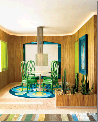
The dining room walls are covered with zebrawood veneer panels. Doug designed the light fixture above the table — there’s that silver beaded chain again!! The chairs were painted in bright green lacquer. Doug and his brother Gene design carpets, and the round dining room carpet is one of their pieces. The cactus planter divides the eating space from the living space…
Doug’s says that his bedroom “can feel as though you’re walking into a fish tank.” That might have something to do with the padded headboard in a glittery blue vinyl, the purple bedspread, ocean-blue pillows, geometric rug in marine colours, and turquoise walls & curtains ;-)
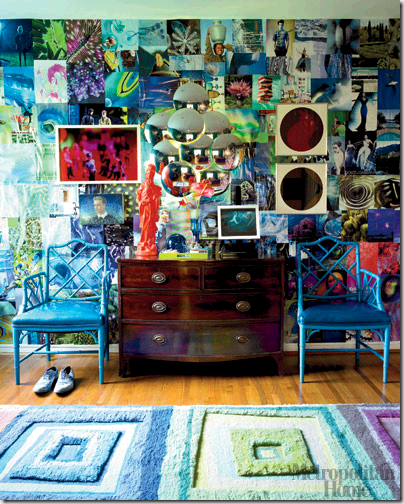
Doug spent months collecting pages from magazines to create this collage wall in his bedroom…
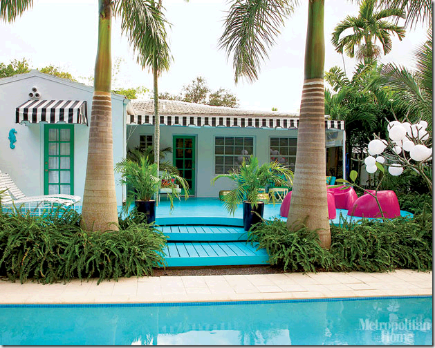
And the colour doesn’t stop inside Doug’s house — check out the patio with the turquoise deck boards, gold hassocks, and bright purple-pink Wendell Castle chairs!! There’s even a turquoise seahorse on the wall next to the green door on the far left…
And the pool area…
So what do you think — could you live in a house with every colour of the rainbow?? Do you appreciate the creativity that Doug put into designing his colourful home, or do you think it’s over-the-top??








26 comments:
Gotta love what one can do with paint! BTY you should get her to design your header, a fun illustration with both of you on either side of the header would be really fun! (and a bargain at $45)
Maria
Meh. It looks a little too self-congratulatory to me. Kind of like Jonathan Adler's studied, purposeful ugliness. Now I love camp and fun as much as anybody, probably more than most. But it doesn't look like a very welcoming place in the sense that there's not a whole lot of soul there. How do you have people over in a set up like that? Where do you put a dinner party for six people? I love his use of color, especially the turquoise deck. I just don't think the furnishings are very tasteful or useful.
Don't hate me.
I really love this, but don't know if I could actually live with it for an extended period. But I LOVE the zebrawood walls, and the beaded fireplace wall. My favorite is the patio and pool area - now THAT I could definitely live with every day! Kathy
Wow! This is one person who is not afraid of color! I love color myself, but like mbkatc230, I'm not sure I'd be able to live with that day in and day out. I love that he brought the color outdoors too - I love his pool area.
Love the outdoor areas, which really refresh the vintage Miami look. I'll be there in August checking out the Design District. Thanks for the early inspiration!
I definitely appreciate his creativity, but I don't think I could live in it! Maybe visit for a week!
Kelly, I have an award for you on my blog. Stop by when you get a chance and pick it up!
I totally love it and would love to live in it. My husband, I'm sure he would not. Perhaps as a vacation home...in my dreams!
Kelly & Victoria,
She will draw something completely different like she did for me (it was not anything like AB Interiors, the only thing that was the same, was that it was an illustration of a woman, the look and feel was completely different. So don't worry about copying me if you like the idea of an illustration.
Great post by the way :)
x
Maria
Wow!! Not so sure if I could live with this much colour but it looks great!
It's truly amazing how color savvy some people are. I absolutely am in love the exterior of this home. The painted patio..., and it's such a nice touch to place the lounge chairs on a rug! That's what it means to me when I say (on my new blog) love is in the details.
Oh, and thanks so much for adding A Beach Lovers Place to your blogroll. You're on too.
I must say I LOVE color but I couldn't live in this home. It looks ok in magazine but it's not me. I do however love the exterior of the home including the yellow and white porch. I love that design is so subjective. Great post, Kelly!
I like and appreciate the bold use of colour. That said, it is not my personal preference though I definitely admire that he's beating a unique tune on his drum (to twist an old cliche). I LOVE certain things: that yellow flowered porch!; that silver beaded fire place wall and the beads again in the DR; the entire DR; the back deck; the entire vignette where he painted that cabinet orange. With all that colour, I would never feel like I could relax, except maybe on that back deck.
Hi Kelly and Victoria,
as a colour fan myself I surely appreciate the courage for creating such interiors and it made me grin. I also admit that there is a consistency in the whole styling that is better than in many traditional or contemporary environments. If I could live in such an interior? Clearly not. It is too "plastic" like, too unnatural and superficial, not a place to feel at home.
But an interesting post - thank you!
Defenitely cannot live with it but if he is happy with the result and makes him happy to live there then thats the whole point. Right?
I couldn't do it myself but it's really fun & crazy & I'd like to visit!!
LOVE the DR chairs!!
I love the outdoor space - especially since it's in Florida. The inside...hmm...the Florida room is OK - I like the walls in that room and the Warhol....
~angela @ peonypatch
It's been fun reading everyone's thoughts on Doug's house. It's definitely not for everyone!! But as qerat said, it makes him happy and that's the whole point :-)
At first, I thought the house was kinda crazy and over the top. But then it started to grow on me. Some of my favourite things about it are:
The Florida room -- I love how he's hung the Marilyn picture, the wall colour and how it contrasts with the white trim, and the wood & metal table.
Silver beaded curtain wall -- I've seen Candice Olson do a similar treatment in a condo that she designed, and it was quite striking. She described it as looking like little beads of shimmering water.
The turquoise deck -- As you may have guessed from my post last Friday, I love turquoise!!
The zebrawood paneling -- It's cool and different.
Bedroom colours -- Love the combination of purples and blues. Not so crazy about the magazine page collage, though!!
Kelly
I sincerely appreciate what Doug has done, but cud I live with it at this time in my life. NO! Been there and done that when I was in my Teens. The elements and colors are very déjà vu. Smiles -Brenda-
I LOVE the backyard, I am moving in! :)
Wow - this man is not afraid of colour! I love colour, but don't think I could handle the vibrancy in this house. There are definitely pieces of the quirky, cool and crazy design that I do love though
- like you Kelly - I love the silver beaded curtain wall
- turquoise - anything turquois
- my favourite though are the two turqouise/blue chairs opposite the bright green sofa - I love the modern look and feel
Thanks for posting!
Hi Kelly,
I can certainly appreciate the design...but it's not my taste. It's a little loud...ok, it's A LOT loud! But well done.
Thanks for an entertaining post!
Sarah
PS: Finally got my laptop! Woohoo!
Forgot to mention - I noticed a lot of people like the silver beaded curtain. It may be from a company called Cascade Coil. It's hard to tell from the pic, but that's what it looks like to me. Worth checking out!
Sarah
This house is crazy, cool, quirky all together. I love the craziness and I admire the strong personality. I would tone it down just a bit if it was for myself and I would choose it as a second house at the beach. FUN!
Love some stuff, but I find the spaces remind me of Better Homes and Gardens in the 50's. I don't know what that's bad! Just uncomfortable.
Strange enough, I love his home. I adore color & commend those that can use it with abandon! I remain however too scared to go that over the top. Someday!!
Post a Comment
Note: Only a member of this blog may post a comment.