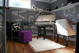
Last weekend was so fantastic… I staged a terrific 21st floor condo!
A few weeks ago I told our DesignTies readers a little about
my plans for Bonnie’s place. Today, the day after her Open House, I’m sharing
ALL the befores and afters! I think you’ll be impressed with the transformation.
BUT… before you scroll down to these fantabulous photos I just HAVE TO share… last Wednesday, sight-unseen and based on photos alone (taken by the Realtor’s photographer…
professional photos of my work!!! I’m so over-the-top happy!!), interested buyers put an offer on my Clients’ condo just shy of asking price!!
WOW!!
The buyers actually viewed the condo on Thursday and didn’t change their mind… of course! Naturally, my Clients kept to their Realtor’s (
Bonnie Monk with Royal LePage) plan to “open” their place for other potential buyers on Saturday in the event that the sale falls through. But it’s looking good so far! I’m so happy for them!!
Now… to the transformation!
Living Room

Apart from removing the toys and clutter from this room, I also asked the homeowners to do 2 things for me… 1) remove the wee shelf and plaques from the wall so that I could replace them with more size and colour appropriate art and 2) swap the sofa & loveseat around… by keeping this configuration I’d be cutting off flow a little to the den, but at least with the loveseat in place of the sofa it would make for a smaller block.
The living room really lacked colour… so I found these pillows which the clients love and intend on using in their new home. Excellent!

The photo below… a hint at the den and my favourite transformation. You’ll have to make your way to the end of this post to see it. Be patient!

Dining Room
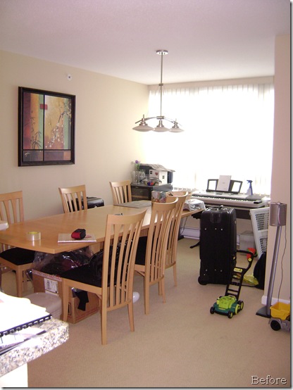
This was a simple transformation… clean up the room, take a leaf out of the table and change out the too-small print on the wall with a long mirror. This condo is a great size… even with the the leaf removed, the table still easily sits 6 people AND there’s loads of room to move around the dining room!
I purchased the mirror at Ikea and stylistically, it’s a good fit with the homeowner’s existing furnishings. What I love about the placement of this mirror – and something you can’t see in the photographer’s image below – is that it beautifully reflects the view to the south of this room (the view through the windows you see is to the west). Also, the mirror reflects the patio and it’s flowers… which effectively invites viewers around to the sliding door and a closer look.

Kitchen

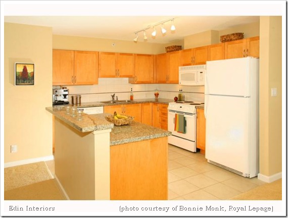
 From cluttered to sleek!
During our consultation I mentioned to the homeowners that a microwave range hood would be a good change… because they liked their hood and wanted to take it with them to their new house, they took my suggestion to heart and changed it out. A great way to show more counter space!!
A few items placed along the counter for colour… some simple baskets filling up negative space above the cabinets… and the kitchen looks like a place where anyone would want to fix a meal!!
Master Bedroom
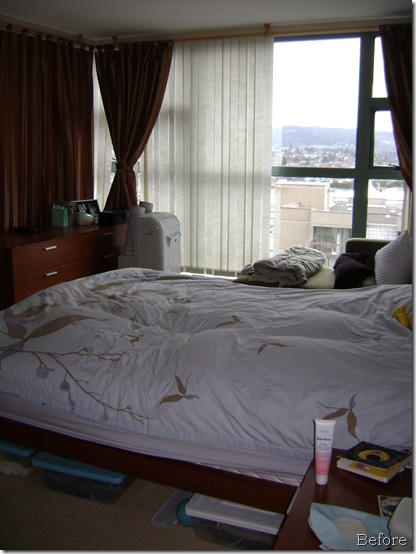
In this room I HAD to work with the existing drapery. With budget in mind, I looked high and low for bedding that would work AND that we could afford! I totally lucked out with this quilt and sham combination. I think it’s perfect!!
I also relocated the bed into the window. I’m a big fan of the bed being the focal point in a room, but that wasn’t my only motivation in relocating the bed. You see… I wanted the space to be open and inviting to viewers, allowing them to walk in and around the room. Also, with the bed placed in this position viewers are encouraged to imagine themselves waking up to this marvellous view. That and breakfast in bed…
Luxury!!


I LOVE how the realtor’s photographer Photoshop-ed images onto the (disconnected) TV screen!! Much better then a black box on the wall!!
A closer look at some of the details…
The goldy-orange box on the mirrored tray is so very special to me… it is vintage(30s) bakelite, and the monogrammed box is from a vanity set handed down to me from my Great Grandmother. It’s a perfect and simple addition to the tray! The yellow bottle is a $4 find from HomeSense (TJ Max) that my step-daughter has laid claim to! How can I build my home-staging goods “warehouse” if she lays claim to all the pretty and fun decor items?! HaHa!!
Pillows… I included additional gold and burgundy pillows to pretty up the bed.
Master Bathroom
Yikes! I caught myself in that photo!!

The existing colours in this room are yellow-undertoned beige (walls) and sage green (counter & accent tile). I worked with them by installing a new shower curtain and – for flow - including the master bedroom’s burgundy and gold.

Second Bedroom - Nursery

I had a lot of fun with this space. In fact, I wrote a little about it in my post
How I spent my Friday night when I recounted the creating of the sweet and naive animal art on the walls.
With the exception of furniture, this room was empty of personality. The homeowners had asked that I work with existing furniture so I had no choice but to make this room a nursery… but how to make it cute
without going overboard (and over budget)? My answer came in the blue elephant pillow I found at Ikea. The purchase of this pillow gave me a palette that I could replicate in a few places throughout the room – like the animal art on the wall – and make this room really special.

The little 1 2 3 baskets… a few dollars at Ikea and a perfect fit with my scheme, as was the green throw on the crib. The blue curtains - another inexpensive find – were made special with the application of coordinating green and red ribbon… the same ribbon applied to the lamp shade (applied by my step-daughter Ashley – she helped pull this room together!)
Family-Guest Bathroom

An easy fix… remove the decals, give the room a good clean, hang a nice print & some fluffy white towels and display simple items on the counter… done!

Den – Bonus Room
My favourite transformation!


In an ideal world, I would have moved the living room furniture into this room (and I would have made the living room into a sitting area with 2 chairs and a table [which, in this floor plan, is open concept to the kitchen & dining room])… but the homeowner often works from home so needed this designated space. What to do…??
Musing out loud during our consultation I mentioned that a chair would be great in this space – make the room a destination, a library – a desirable place to read a book and lounge. It was then that the homeowners said, “We have a chaise in the bedroom.” Perfect!! And it is, don’t you think?!

Ohhhh… the bookcase!!
When I asked the homeowners to pack up everything the husband said, “Everything?!”. “Everything” I said. They did such a fantastic job declutering ALL the rooms in their home, making my job so much easier!
When it came to dressing the bookcase, I focused on simplicity and symmetry. Styling bookcases for sale is different then styling for living… the similarity though is about making it look good!

So there it is… my first home staging job.
I had
soooo much fun that I can’t wait until the next job!! Don’t get me wrong… I loved
designing and building Patti’s bathroom, but the stress of seeing a large project like that through to completion may be more then I’m willing to bear on a regular basis. Occasionally maybe… we’ll see.
BUT… building a staging plan, shopping for decor items for this condo, preparing some of the special items like the art and curtains in the nursery, actually styling the condo… it was fantastic! I loved it!! I could do this over and over again, no problem!!
I just need some more clients!! ;-) Is that you?!
With only a few minutes to impress potential buyers, home-staging is the best marketing tool when selling a home. Achieve
top dollar… have
Edin Interiors style your home or listing so that it stands out from the competition!!
Edin Interiors services the Greater Vancouver real estate market.