

… AND share some of my favourite posts long lost in our archives.
How terrific is that?!
If you’d like to re-play one of your archived posts, too… if you’d like to get out in the sun or tackle that project that’s been waiting for you to find free time… Rewind with us!! You’ll find all the info you need at the end of this post.
The post I’m sharing with you today IS special to me… not only because it showcases the REINVENTION of our Dining Room & Living Room doorway (the one renovation project that my husband and I are MOST proud of)… but because one of my favourite bloggers – Paul from the blog Kitchen and Residential Design – loved our work, wrote about it on his blog and compared the approach we’ve taken in our renovation work to the philosophy of Sarah Susanka and Mark Vassallo’s new book Not So Big Remodeling: Tailoring Your Home for the Way You Really Live. I was thrilled!! Not only that… the post Paul wrote was picked up and published in the Naperville Sun (serving the Chicago suburbs)!! WOW!
I hope you enjoy our work as much as Paul did! :-)


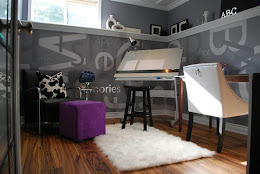
I love our little house… I’ve always loved it even when it wasn’t as cute as it is now :-) From the moment we moved in, though, we’ve been living in mayhem… yep, we’ve been remodelling! Readers can find evidence of our self-inflicted life of chaos in both my fireplace post and my bedroom metamorphosis.
So what remodel am I sharing with you on this lovely Monday? Hang tight!! First a little explanation… then photos!

Hopefully this floor plan allows you to see that the centre of the house was originally a boxed in “hallway” entered from each room through an actual door. The front room now designated “dining room” was originally a bedroom.
Okay… we wanted to open things up!!! We couldn’t go open-concept without some major expense so we did the next best thing…
We created a wonderful archway that links the living room, dining room and kitchen!!

This is the only Before photo I have – but it shows you how we removed the wall between the kitchen and the hallway to open things up – and you can see the two doorways, one into the front bedroom and the other into the living room.
Now let’s look at some of that mayhem I spoke about!!


When we remodelled all the rooms, we replaced the plaster & lath with drywall… not so with the living room. Because the p&l is brittle and almost as hard as cement, Brian used his circular saw to create a cut line that would protect the p&l that we would NOT be removing. The section that we removed came off without too much stress and only a little damage to the walls.

The photo to the left shows you the 
I love how the new archway brought the natural light into the kitchen! (pic to the right)
Here’s the archway all drywalled – again, the view is from the kitchen.


I LOVE this curve and knew that I wanted to re-create this in the archway corners. I’d seen what I wanted in other older homes so I knew it would be perfect for our house.
Here’s a photo of the forms that Brian built and adhered into the corners.


Looks pretty good, hey?! But these walls needed colour!!
Now for the BIG reveal pics!! :-)

Viewing out from the Dining Room to the Kitchen and Living Room (sorry for the renovation mess!)

Looking at the archways from the Living Room (yikes! more reno mess!)

A closer look at the archway corners and the coved ceiling in the Living Room. Perfect!

I hope you’ve all like the transformation of the archways linking my kitchen, dining room and living room… we love it!! You even got a sneak peak of my kitchen transformation!!

Now it’s you’re turn!!
If you’d like to re-wind with us… you know, be lazy and enjoy a lovely summer day OUTSIDE instead of in front of your computer pulling together a Wednesday blog post… just…
…re-publish your post to the top of your blog. Then…
Copy and paste the Rewind Wednesday button to your post. That way your visitors will know that you’re participating in DesignTies’ Rewind Wednesday blog party!
Please link back to the host blog, DesignTies, and encourage your readers to come visit us for a list of other Rewind Wednesday blog party participants.
If you’re participating in Rewind Wednesday please be sure to add your permalink (NOT your general blog address) in Mister Linky below. The permalink is the URL of your post. Simply copy and paste.
Go visit the other bloggers participating in Rewind Wednesday!!
Mister Linky
The following blogs are participating in our Rewind Wednesday blog party…


22 comments:
Great transformation of which I have seen first hand!!
Wow! Those 'secretly' revamped archways look fab :)
Victoria,
The intersecting arches are genius. They are beautiful and perfectly executed. Bravo!
I am always absolutely amazed at your vision with space planning and designing. Even though I have seen some of these pics before it is so intriguing and the rooms are gorgeous. The floorplan really puts the space into perspective. I love it. Hugs, Marty
Thanks for the insight Victoria- you guys have done an amazing job! Now I know what you meant about he openings. Lovely.
Michelle
Stunning architecture! What a statement. Love your blog too!!!
Kim
Beautiful work! Wonderful arches and flow. You are all very good at what you do!
Scribbler
oh I just love the doorways!!! Such character!
Beautiful redo! Wowie the view!
Happy Monday!
WOW... that is QUITE a transformation.. looks great!
Love the wall colors with the white wainscoting! And those arches are amazing.
VICTORIA, YOUR HOME IS ONE I COULD EASILY FALL IN LOVE WITH AND LIVE THERE FOREVER, LETS SAY IT WOULD BE ONE I COULD CONSIDER MY DREAM HOME ....WHY? IT HAS CHARACTER, ITS HOMEY AND ITS NOT COOKIE CUTTER AND IT WOULD LOOK BEAUTIFUL EMPTY.
HUGS
JANET
This is stunning! Love the pendant lights.
What an amazing transformation. :)
*** What an absolutely WONNNNDERFUL change!!! Sincerest congrats on a beauuuutiful, creative project!!! Warmly, Linda ***
Beautiful! I love the curved detailing in the doorways! Congratulations!
What a difference! Your handiwork is just perfect!! Those doorways are gorgeous...
AWWWWW!!!Mazing!!! This is such a cool idea. Love it. I am becoming a follower and adding you to my homespun friends(blog roll) and hope you'll come do the same. I'm going to check out all the other posts.
This is my first time to your blog. I hope you will come by for a visit and stay awhile.
Its So Very Cheri I also have a party on Mondays called the Knock Off Knock Out go check out some amazing projects.
Cheri
Its So Very Cheri
I'm adding your button as well. I was the first one.
Cheri
Victoria, these intersecting arches will always be on my list of examples of the right way to go about renovating an older home. I still fawn over them six months after I saw them for the first time. It's sheer perfection!
What a beautiful home. I love the architectural detail you've added to the space. Note to Kelly... I'm sorry that my contest is only open to U.S. residents... its because of the shipping costs of the prize. But, I will ask if they will consider Canada too and let you know! (I've never shipped anything to Canada... is it expensive?).
What a beautiful transformation. Worth all the sweat and tears for sure.
xo,
cristin
love the rewind wed thingie too - i'll have to try it soon.
Your colors are yummy and the archway is gorgeous. Nicely done. Love your house.
Pam
Post a Comment
Note: Only a member of this blog may post a comment.