
And then head over to Between Naps on the Porch to check out Metamorphosis Monday. There may not be any other interactive transformations this week, but I’m there are lots of great design makeovers to see :-)


Habitat for Humanity’s goal is to raise over $1,000,000 through the sale of the house and other special events. The money will provide 10 low-income families in the Ottawa region with homes, and will also support the building of two homes in Haiti.
Friedemann Weinhardt from Design First Interiors and Chuck Mills from Chuck Mills Residential Design & Development Inc. were the co-lead designers for the project. The exterior architecture, landscaping, and interior rooms were designed by various Ottawa-area designers.
The house is in a quiet, older established neighbourhood. These are a few of the houses just up the road The Gift Home. I think they all have a hint of Mid Century Modern.


Exterior
Barry J. Hobin, Barry J. Hobin & Associates Architecture Inc.
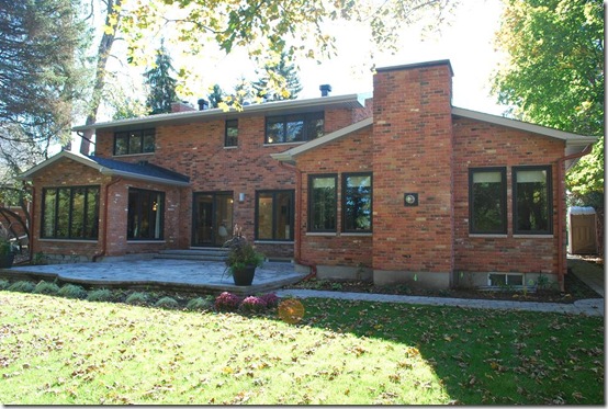
The front facade was updated with new brick and stucco, energy-efficient windows, and a modern portico. Love those garage doors!!

I assume the music room (left) and family room (right) were both added to the back of the house. I really like the garage doors.
Landscape design
Gino J. Aiello, Gino J. Aiello Landscape Architect
The garden was designed to be colourful, low maintenance, and attractive from spring to fall. There’s an underground sprinkler system and lots of room to expand the garden and to add a swimming pool.

Now let’s go inside. The interior is mainly modern, but with some elements of the ‘60s to honour the decade that the house was built.
Entry, Powder room, Laundry room
Andre Godin, Andre Godin Design Inc.
It was hard to get a good look at the entry at the open house, with all the people coming in and out and shoes piled near the door. So this one is from the real estate agent’s web site :-)
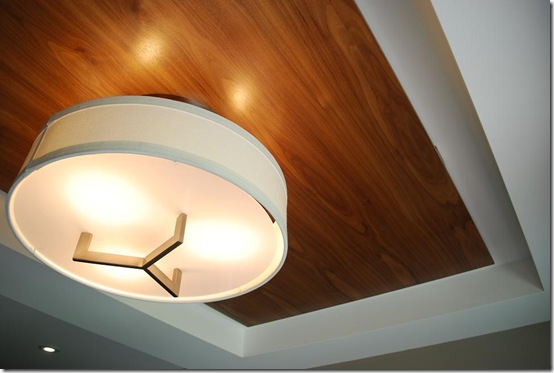
But one thing I noticed on my way out was the beautiful ceiling — a wood panel inset into the tray ceiling. Most rooms in the house have interesting ceiling detailing.
It was tough to get a good angle of the powder room, so here’s the best I could do. I really like the look of a sconce installed on a mirror.
The laundry room is on the second floor and doesn’t take up much room. There’s a stacked washer & dryer and a fold-out ironing board in one of the drawers. Not fancy, but certainly bright and convenient, being right next to the bedrooms.

Foyer & staircase
Chuck Mills, Chuck Mills Residential Design & Development Inc.
Friedemann Weinhardt, Design First Interiors
I don’t normally like walking into a house seeing the staircase right in front of me. But the staircase in this house is so beautiful and well designed, it’s almost like a sculpture or a piece or art. The creamy white stone wall contrasts beautifully with the dark hardwood and simple metal & wood railing.


Study
Gordon Weima, Gordon Weima Design Builder
The study is to the left of the entry. The sunlight was just streaming in through the floor-to-ceiling window, which just added to the warmth of all the beautiful cherry wood on the walls. The flooring is leather tiles. It’s a modern take on a traditional wood-paneled study.

Can’t find the fridge?? It’s behind that tall white cabinet door to the left of the vent hood.

Lots of storage space in this wall of cabinetry, and TWO ovens!!


The tiles are really pretty and unique. So is the pig. Well, unique anyway!! ;-)
Living room, Dining room, Piano room
Linda Nolan-Leeming, Linda Nolan Interiors
Of course I love the living room — the accent colours are aubergine and apple green :-) And I adore the tufted sofa and the mirrored coffee table.

The fireplace is beautiful too, but a bit over-dressed for Christmas, I think. Actually, it’s just too early to be decorating for Christmas!!


The dining room has a great simple decorative trim on the walls, and a beautiful chandelier. There are a LOT of great light fixtures throughout the house.


The piano room is next to the dining room and has the same trim on the walls. Love the floor-to-ceiling windows on all three walls. Actually, that’s another detail about this house that I love – all the windows have dark brown trim both inside and outside.


Master bedroom & Ensuite
Chuck Mills, Chuck Mills Residential Design & Development Inc.
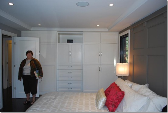
The master bedroom is modern & simple, but also warm and welcoming. I love the twist on a typical headboard — the trim detailing on the wall behind the bed creates a wonderful focal point in the room.

The wall of custom-built floor-to-ceiling cabinets eliminates the need for unnecessary furniture. That silly lady refused to move — identity hidden to protect the annoying ;-)
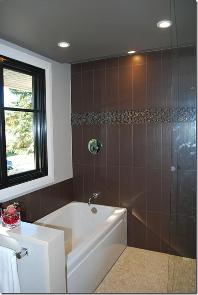
The ensuite has two separate vanities (one on each side of the doorway), which I prefer over one big double vanity. And the tub is in the shower.

I know I’m using the word a lot, but I love the mirror and the pendant lights above the vanity.

Bedroom 2 & Bedroom 3 with shared ensuite
Carolyn Munro, Carolyn Munro Design
These two bedrooms are connected by a bathroom in between. Bedroom 2 is more feminine with its turquoise & beige colour scheme. The upholstered panel behind the headboard adds colour and interest and softens the pewter metal bed. See what I mean about the ceiling details throughout the house??


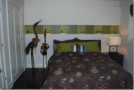
Bedroom 3 also has an interesting focal point behind the bed — an inset accent band of light and dark green “tiles” and recessed lighting. (Don’t ask me about the crazy birds, I have no idea why they’re there!!)

Looking into the shared ensuite from Bedroom 3 (the green bedroom). You can’t see it in the picture, but there’s a skylight in the ceiling.

Guest bedroom & bath
Marianne Dupont & Dean Large, [In]tempo Design Studio Inc., Astro Design Centre
This is the smallest bedroom and bathroom. But hey, I won’t complain if whoever buys the house lets me stay here!!


The second floor is sort of a U-shaped hallway, with Bedrooms 2 & 3 at the top of each side of the U. (Green bedroom on the left, turquoise & beige bedroom on the right.)


Standing outside the green bedroom and looking towards the master bedroom.

Colourful artwork at the top of the stairs.

Now let’s go all the way down to the basement…
Basement
(Media/games room, Fitness/playroom, Bathroom, Wine cellar)
Norm Lecuyer, Just Basements
The basement was designed to be a place where the whole family can hang out together and play games or watch TV. The flooring down here is gorgeous walnut.


The bar area is behind the sectional.

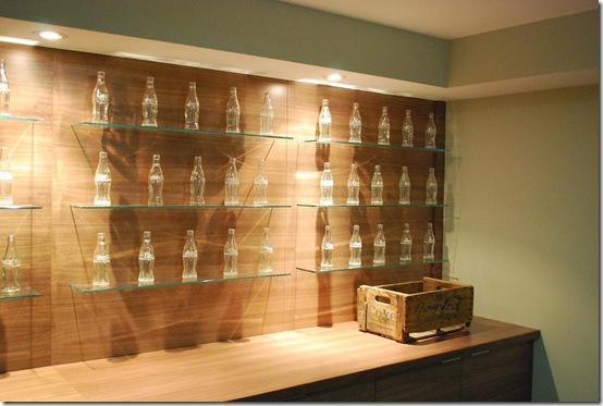
And opposite from the bar is this cool display of old Coke bottles. You could display all sorts of collections on these shelves.

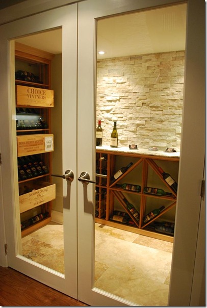
The wine cellar is at the bottom of the stairs.
Great wood vanity in the bathroom. This is actually a full 3-piece bathroom, which is handy because it’s right next to the fitness room.


For more information on The Gift House, go to:
The Gift Home is being sold by Myra McKeen at Milestone Real Estate Inc. If you happen to have a spare $1,170,000 floating around, it could be yours :-) And if you buy it, you HAVE to let me come over and visit. Regularly. Like, every day. Heck, there’s four bedrooms, I’ll just take one of those and never leave!! ;-)

Freshly Designed by Katie Lane @ Lemon Cherry Blogs