I want to thank everyone who left comments on my last post about Kylie. I can’t tell you how much it means to me that you took the time to leave me words of support. Thank you all so much, and I’ll be by to visit all your blogs soon.
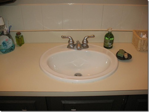
In October, I posted about helping my friend Sylva do a complete bathroom makeover. This picture was our starting point:
Sylva loved the simple lines of the black vanity and the tiled wall. Because her bathroom is small and the vanity fits into a niche between two walls, I suggested that she go with a floating vanity with similar simple lines. Like this one:
We went to a A-1 Millwood in Ottawa to have a vanity custom made. Sylva had originally wanted to go with a charcoal grey finish, but after we looked at the different finishes that were available, we both decided that the wenge finish would be a better choice.
The floor tiles look blue in the picture, but they’re actually white with a grey & blue strie design. Sylva had narrowed her floor tile choices down to three, and we decided on this one together. As you can see, the tiles are laid in a brick pattern.
Sylva wanted simple white tiles for the tub surround. She selected 6” x 8” tiles and had them installed horizontally. she kept her existing shower head and faucet, because they’re still in good condition. The tub & shower are across from the vanity.
I really hoped she’d go with a glass countertop, but she wanted to go with a stainless steel countertop from Ikea. I won’t bother giving you the link because the countertop has been discontinued. So, Ikea countertop it was!!
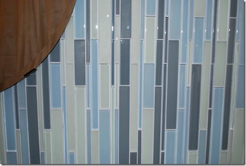
The focal point of the bathroom is the wall behind the vanity. Sylva wanted glass tiles in greens and blues. When I showed her a sample of these Cane Series tiles from Mirage Glass Tiles, she decided they were just what she wanted. I suggested that she have them installed vertically — I think they look great!! The vertical layout looks sort of like water running down the wall.
We found this simple square white vessel sink online. The chrome faucet is made in Italy. And here’s an important tip about buying a faucet – make sure it reaches far enough over the sink that the water doesn’t splash up and out!!
Sylva’s old vanity light fixture was nice, but one of the glass shades has yellowed. She replaced it with this frosted fixture:
And finally, the paint colour. It would have been nice if we’d had the time to try out a few different colour samples, but Sylva was under a time crunch. Because the bathroom is small and the window is under a carport, I thought a lighter colour would be better. We chose Sico Winds of Change, sort of a light grey-brown-green.
And with all those selections made, Sylva’s bathroom went from this:
To this:
The vanity went from this:
To this (picture taken standing on a stool in the shower!!):
It’s not exactly elegant, but I have to include a before shot of the toilet.
This is really where the whole reno started. There were some damaged tiles around the toilet that Sylva wanted to replace. But the house was built about 50 years ago and they’re the original tiles, and she couldn’t find a match. So Sylva decided to to a full reno — which was a good thing, because there was a lot more damage to the floor than just the tiles. The whole subfloor needed to be replaced. And seeing as she’s updated the rest of the house, it made sense to update the bathroom. Here’s her new toilet, complete with a self-closing lid and dual flush:
And a few more pretty shots to end with (excuse the wrinkly shower curtain!!)…
Sylva’s cat Neko loves to hang out in the bathroom. Sometimes he curls up in the sink for a nap :-)
This bathroom makeover was a collaborative effort, and I have to give Sylva a lot of credit for making quick decisions and finding a lot of the items herself. And in the end, we accomplished what Sylva wanted — a simple, Asian-inspired bathroom that’s just her style. And Neko approves too :-)

![black vanity[3] black vanity[3]](https://blogger.googleusercontent.com/img/b/R29vZ2xl/AVvXsEiTbKeXKlTOtz306FL2aK_7Nsn-ourGpcjhb-xx3vTGgOGaHx-lMHSmWWTLCk4un6Mm3KUXVz5hitXRPhyLIY1zw5xFkDiQbWSKVHhogfs3zlQWKRVBzpmuQW0b1zmew30izTJs6L_efyk/?imgmax=800)
![vanity decorlux[5] vanity decorlux[5]](https://blogger.googleusercontent.com/img/b/R29vZ2xl/AVvXsEgLSZUVudhhymejunswre7tldVX3GoBU3Vt44BHjlSamSBtkbj0nAC78vgOb9zoT7mbA7LmJz4JI4Lab-mfAHDT1864dgJpWXPW5-6FfYREKIklTvveijaBoUjg7ZpUonP87UDgnNkqh6A/?imgmax=800)


WOW! So gorgeous! You and Sylva did an absolutely fabulous job! I totally love that vertical tile and the cabinet. Bravo! What a fantastic project to add to your portfolio!
ReplyDeleteAs always, fantastic work Kelly! I also love the way the tiles are vertical rather than horizontal...very modern look indeed. These are always my favourite posts as I love seeing before and after shots. Great choices for the bathroom you and Sylva selected...very much my style and taste.
ReplyDeleteMrs B xxx
That bathroom looks great, Kelly! The tile really makes the whole thing, in my opinion. I love it! Great job!
ReplyDeleteWow Kelly, this just came out gorgeous! I love the tile, and the vertical placement is perfect. Love the floating vanity. Fantastic reno! Kathy
ReplyDeleteWow, who would have thought that the tile would make that room "pop" ! It looks great !
ReplyDeleteKammy
Hi!
ReplyDeleteThanks for stopping by! I appreciate your comments!
Your interpretation of the original pic is lovely. The tile makes a strong graphic pattern and the vessel a nice center! Neko's eyes look superb in there too!
Lovely makeover!
love, kelee
Brava! That bath looks fantastic. You're really good at this!
ReplyDeleteIt looks awesome -very chic! Stainless steel looks great, but..., well you'll see every tiny spot and smudge.
ReplyDeleteKelly, your button disappeared in your side bar (and in mine too). Just thought I let you know.
Beautiful bathroom transformation, Kelly. it looks so fresh and clean and so stylish...Christine
ReplyDeleteThat vertical tile was genius!
ReplyDeleteGreat job Kelly :)
ReplyDeleteWhat a transformation
WOW! This is absolutely fantastic!!! I love the vertical placement of the tiles and the "floating" vanity and most of all the square vessel sink.
ReplyDeleteHugs, Lana Austin
Simply stunning! Great job!
ReplyDeleteOh gosh, I'm amazed you're posting so soon. My heart truly goes out to you Kelly.
ReplyDeleteI definitely remember this bathroom and I must tell you I would pay you anyday to do a similar bathroom for me! This is exactly my style -- or exactly what I long for. My fave above all is that amazing glass tile but moreso because you had it applied vertically instead of horizontally! Love that big time! My other fave thing (everything is, however) is that light fixture. What an excellent job you did.
Wow! That is wonderful! What a great job!
ReplyDeleteI love it! Those glass tiles are TO DIE FOR!
ReplyDeleteYour project came out fabulous. Love the glass tiles, so pretty. They make the room sparkle and shine. I'm also liking the vessel sink alot!No doubt your clients are very happy with the results :)
ReplyDeleteSusan
That bathroom is magazine worthy! Great job - love ALL of it!
ReplyDeleteIt vibes with tranquility. I love it. So cleen and refreshing! I LOVE the tiles vertical. Great job girls!
ReplyDeleteYes, placing the tiles vertically looks incredible! It's so different.
ReplyDeleteWonderful!! The tile is amazing and really makes the bathroom dazzle!!
ReplyDeleteGreat job.
Kelly,
ReplyDeleteWhat a great project! It turned out beautifully. Colors, style and finishes are really appealing. Great job Ladies!
Thanks for stopping by Ideezine and Kelly it's true our pets fill us with such joy that's unsurpassed. Each pet is so unique and no two are alike. Kylie lived a long time as did my Kayla. Huskies have such a sweet disposition and they're panting and quick action of run and stop always made me laugh.
Kayla was a husky/chow with a light grey mask, brown eyes and a stripped tongue of grape and pink (chows have purple tongues) Both Kayla and Kylie have other assignments now. As much as we dreaded the day they left us in
physical form only means they will always be with us everywhere else.
Give yourself all the time you need to heal it's a slow process for a reason.
Blessings
Bette
love that you installed the tiles vertically- it's so fun to see design with a twist. nice work!
ReplyDeleteKelly-thanks for the link to the purple and red interiors- aren't they fabulous?
Can't believe that is the same bathroom! Going vertical was a great choice!
ReplyDelete~Tracy
I love what you've done with this bathroom, Kelly! The tile's 'waterfall' effect is amazing; it has so much movement. I just gave your beautiful office the thumbs-up. Good Luck!
ReplyDeleteKelly
Wow that tile totally makes the bathroom! Exactly how I would have done it, go big or go home with mosaic/listello tiles, I say!
ReplyDeleteBeautiful work Kelly, you are very talented!!
J'adore glass tile!!! Have thought about using it as a backsplash in my kitchen... hmmmm
ReplyDeleteThis is just gorgeous. I'm sure the client is thrilled. I just wanted to say that the inspiration bathroom matches my kitchen:)
ReplyDeleteNow that's an improvement :) Great job! I love the tiles.
ReplyDeleteWow! That tile wall is stunning! What a beautiful makeover.
ReplyDelete