Besides the Colour in Decor class I’m taking this fall, I’m also taking Drafting. Our latest assignment is drawing textures. Wow, it’s not easy!! But it’s so cool to see how simple techniques can create realistic-looking texture. We’re using four basic shading techniques. For all the techniques, you have to gradually build up the layering to achieve the correct tonal effect.
Hatching is a series of more or less parallel lines. The spacing and density of the lines controls the lightness or darkness of the shading. Hatching can follow the contours of a form to emphasize the orientation of the surfaces.
Crosshatching
Crosshatching is a series of two or more series of parallel lines to crate tonal value. The simplest crosshatching consists of two intersecting series of parallel lines. Using three or more sets of lines helps create a greater range of tonal values and surface textures. Crosshatching renders a darker range than hatching.
Scribbling involves drawing a network of random, multidirectional lines. You can vary the shape, density, and direction of the strokes to achieve a wide range of tonal values and textures. The strokes can be broken or continuous, straight or curved, jagged or undulating.
Stippling
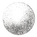
Stippling creates shading using very fine dots. It’s slow and time-consuming and requires a lot of patience. Tightly spaced dots define sharp and distinct edges. A looser spacing of dots implies softer, more rounded contours. The dots should be uniform in size.
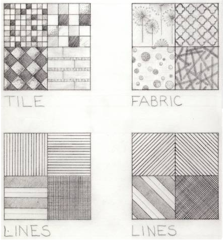
So what can you draw using these four techniques?? Lots of things!! These are the textures we had to draw for our assignment. Believe me, I totally suck at drawing, but knowing how to create shading properly really helps!!
Try it yourself — just grab a piece of paper and a pencil and see what you can do :-)
Source: Architectural Graphics by Francis Ching


Ok! I will try!
ReplyDeleteHave a nice weekend Kelly!
Greet
The timing of this post can't be more perfect. I was having a difficult time rendering textures in interior sketches. Thanks Kelly:)
ReplyDeleteThis is extremely cool.
ReplyDeleteI'd say you were pretty good at drawing Kelly - those look great!
ReplyDeleteNow I want to dig out my table top drafting table, pencils and vellum ... it's so cool to create such texture with pencil and paper ...
This is great! Reminds me of art classes when you learn to shade by figuring out where the light is coming from. Love the different techniques you shared. Thought your samples were pretty darn good!!
ReplyDeletemarcie
Kelly,
ReplyDeleteBrings back memories from architectural drafting, landscape drafting and art classes.
Here's some tips:
Switch out the bulb in your drafting swing arm lamp to a full spectrum light bulb. Colors are true and you obtain better results because you see more.
When you're checking your work turn your piece upside down and view it by stepping back from it. This reveals the balance of shading, color, and symmetry.
For sharper results sharpen your pencil more often before it wears down, like after every few strokes.
These worked for me and it trains you to pay attention to the details from all angles and get and "A" in drafting and art classes.
Neat! You did a great job on these!
ReplyDeleteThank you for this smart little lesson! I love learning this stuff. ;)
ReplyDeleteThose are awesome Kelly. Nice post.
ReplyDeleteI read your comments this morning on my blog, thank you. I'm finally all caught up with my work load and back on the radar.
Have a great week!
Susan